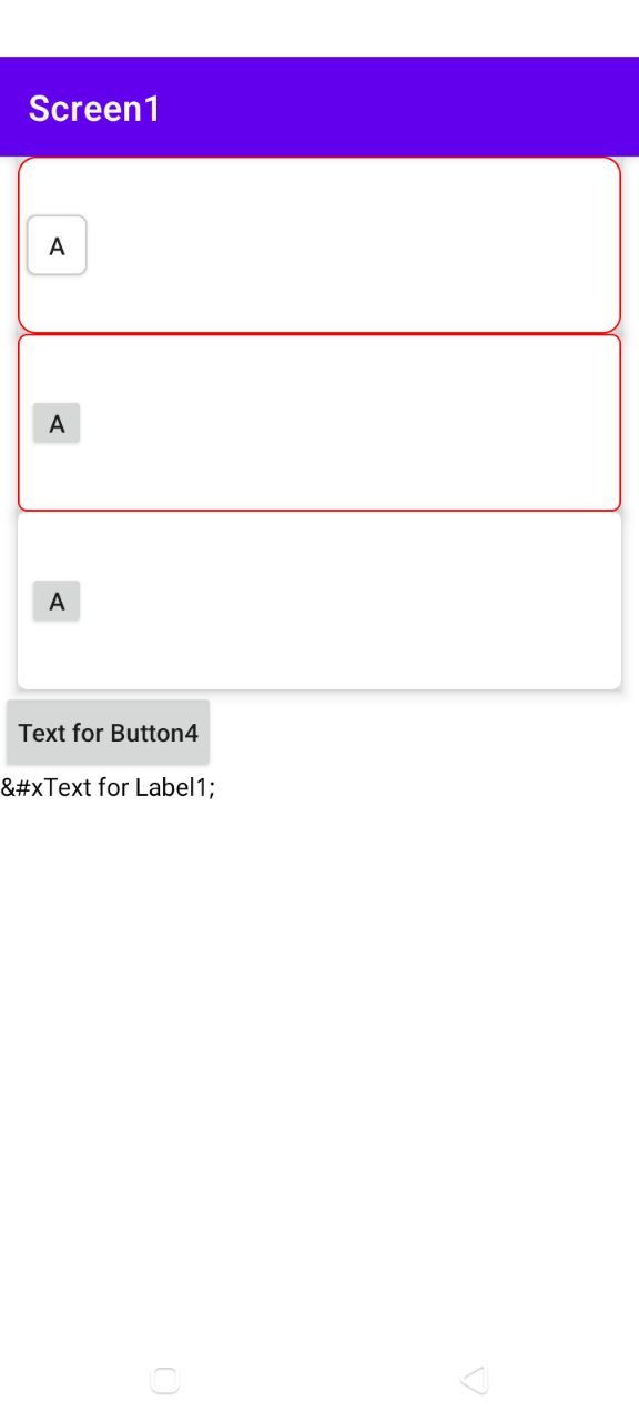
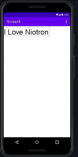
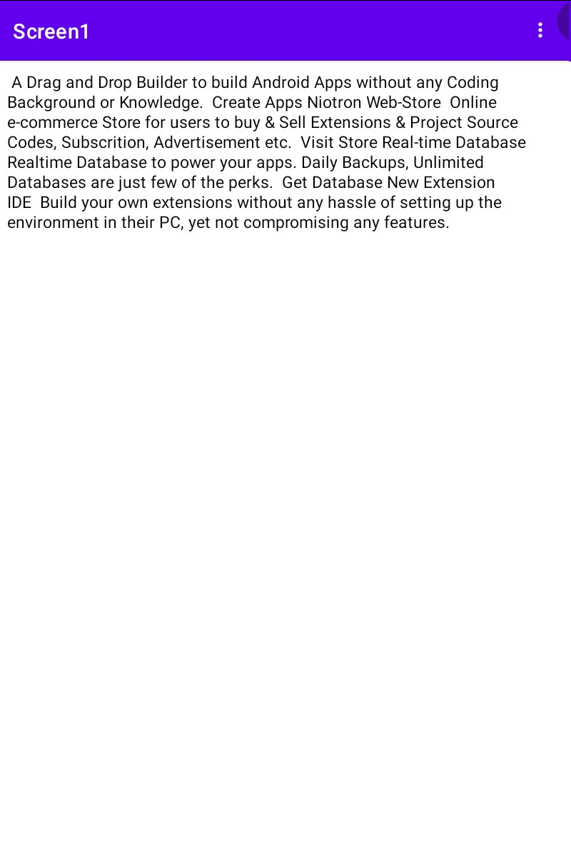
Import Label Component , This is how Label component looks like.
This is viewer
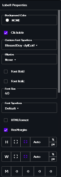
This is properties
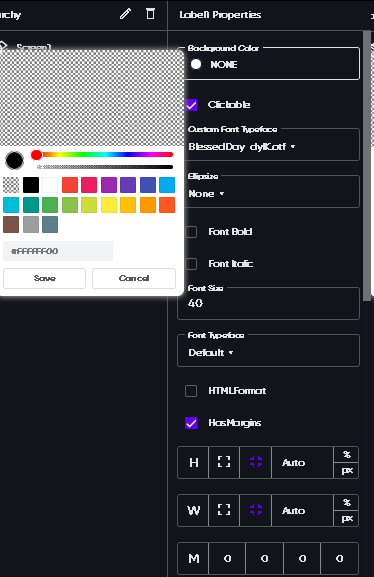
- Background - Set the background colour of your label
- Clickable - Default enabled, If it’s enable it will raise onClicked event i.e [on click yellow block]
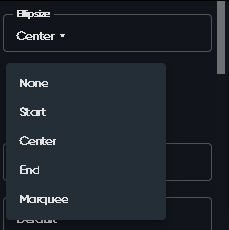
4. Ellipside


- Set text font bold enable or disable
- Set text italic enable or disable
- Set text font size
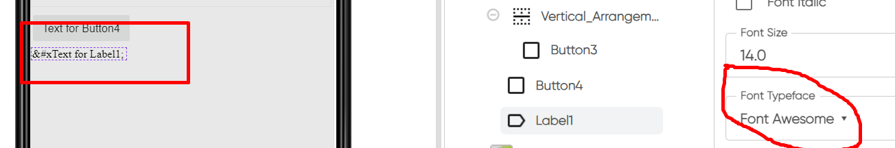
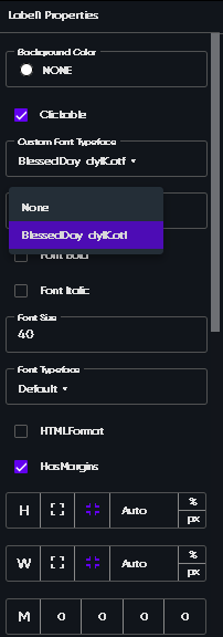
- Default font typeface this are in-built font typeface by Niotron
HtmlFormate , HasMargin, Height,Width,Margin,Padding
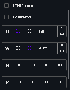
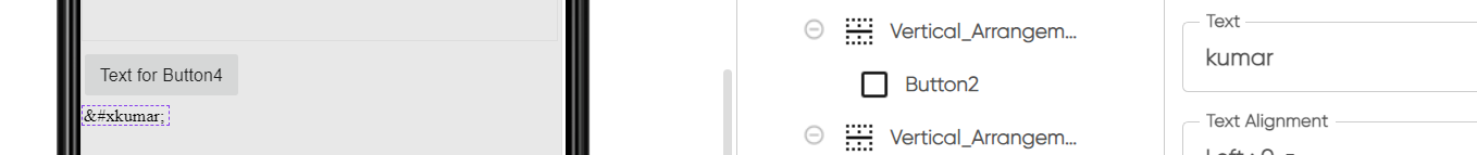
- You can use html to make your own text style font
- Label as a component has in-built margins you can enable or disable it.
- H - Height of label a. match_parent[fill] b. wrap_content[auto]
- M - Margin of label yes this is best feature , you can set margin of the component by self.
- P - Padding of label
JustifyContent , Long Clickable,Max Lines , Opacity,Selectable
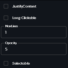
1. JustifyContent
Screenshot A -
Screenshot B -
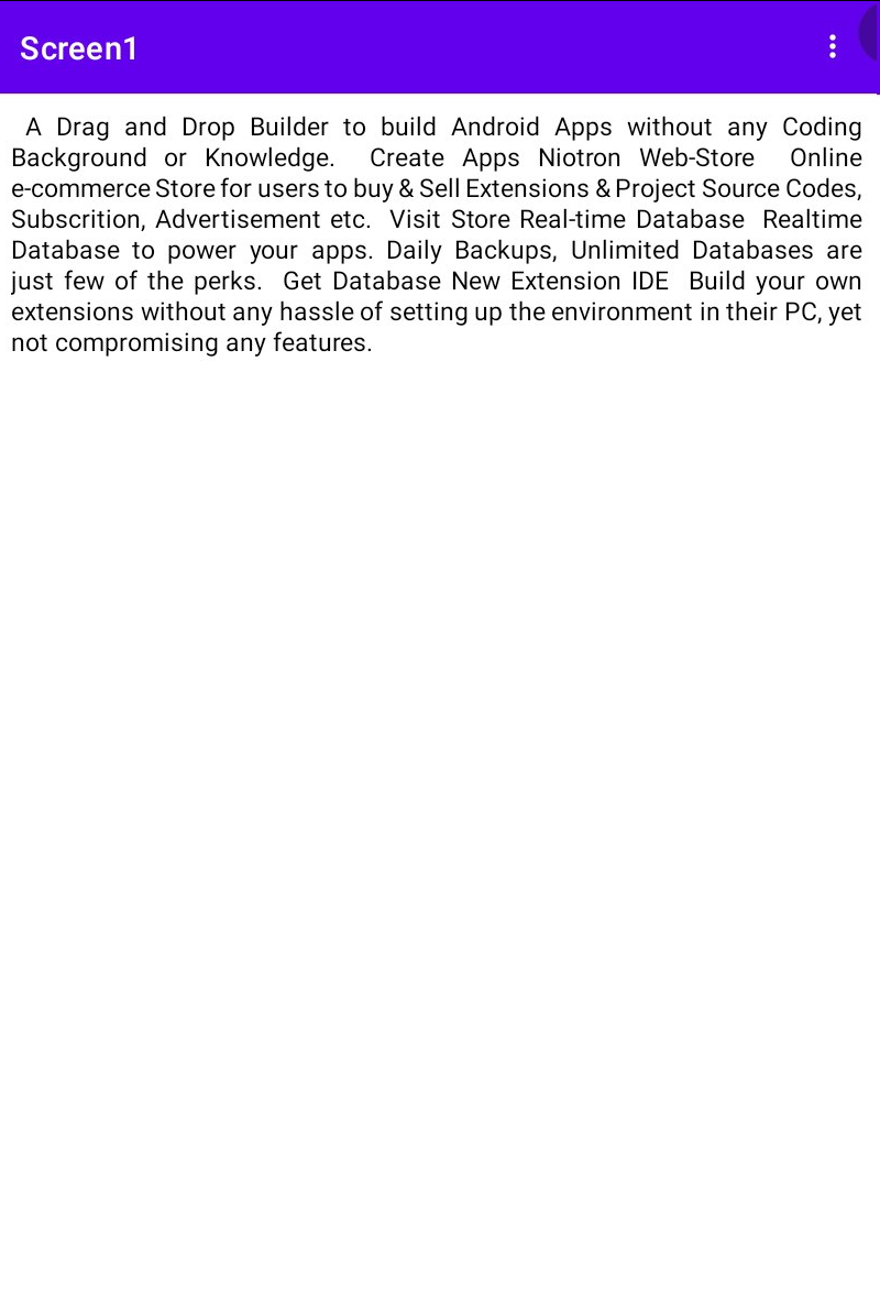
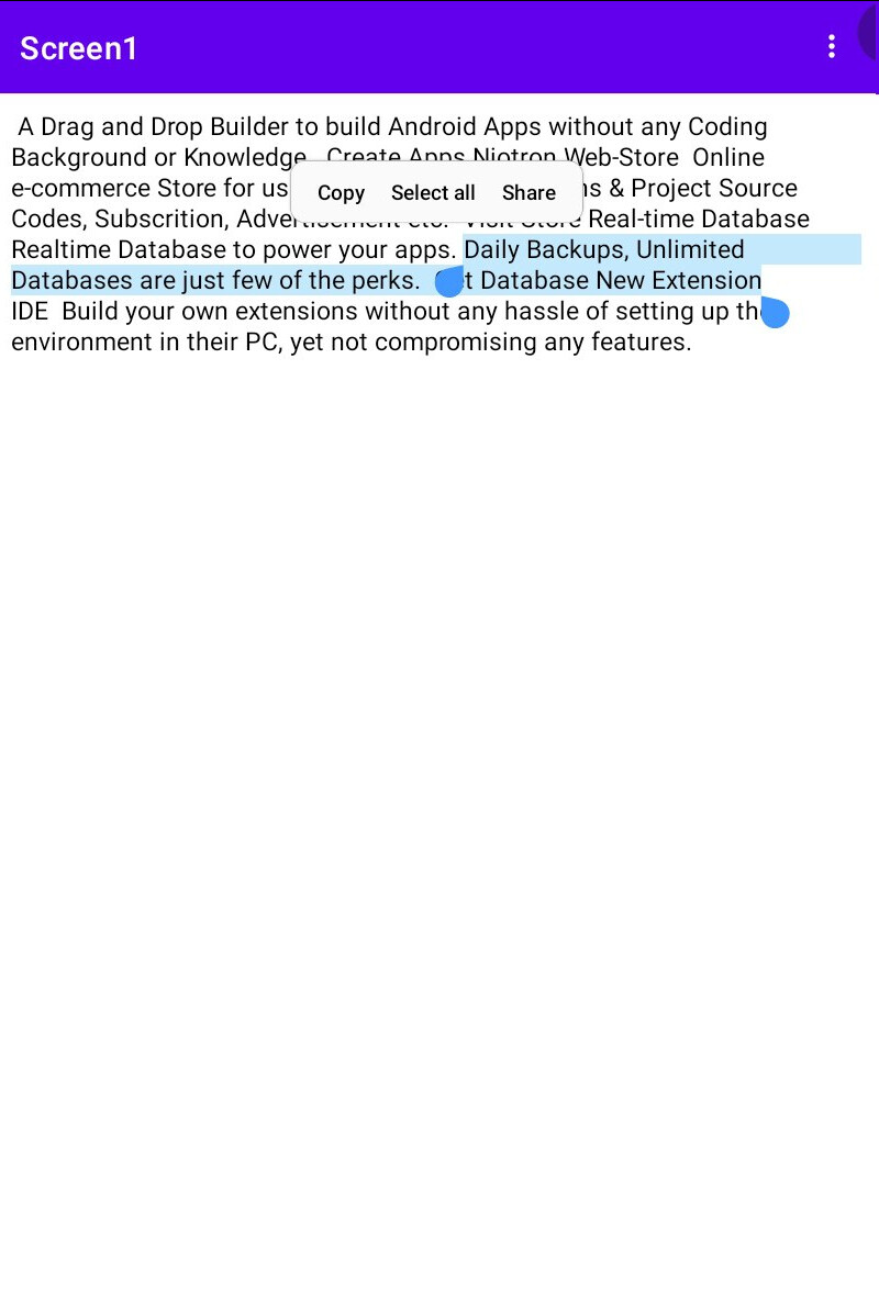
You can see difference between Screenshot A and B , A’s have uneven distance between text and B’s have perfectly.
- LongClickable if enable register event onLongClick [onLongClicked yellowBlock]
- Max Lines - This allows you set custom Lines you wanted to show to users
- Opacity - It’s same as making component transparent from lower to higher transparency rate
Show Links,Text, TextAlignment, TextColor, Visible,Word Spacing
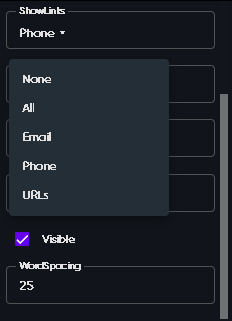
1.ShowLinks
If Show Links = “All” then it looks like this -
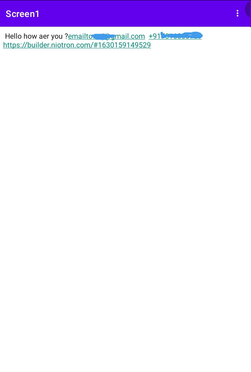
Note - ShowLinks Only works if you set data from blocks section
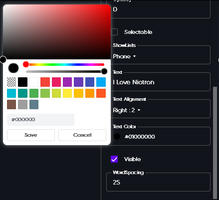
2. TextAlignment
It contains Left ,Right,Center
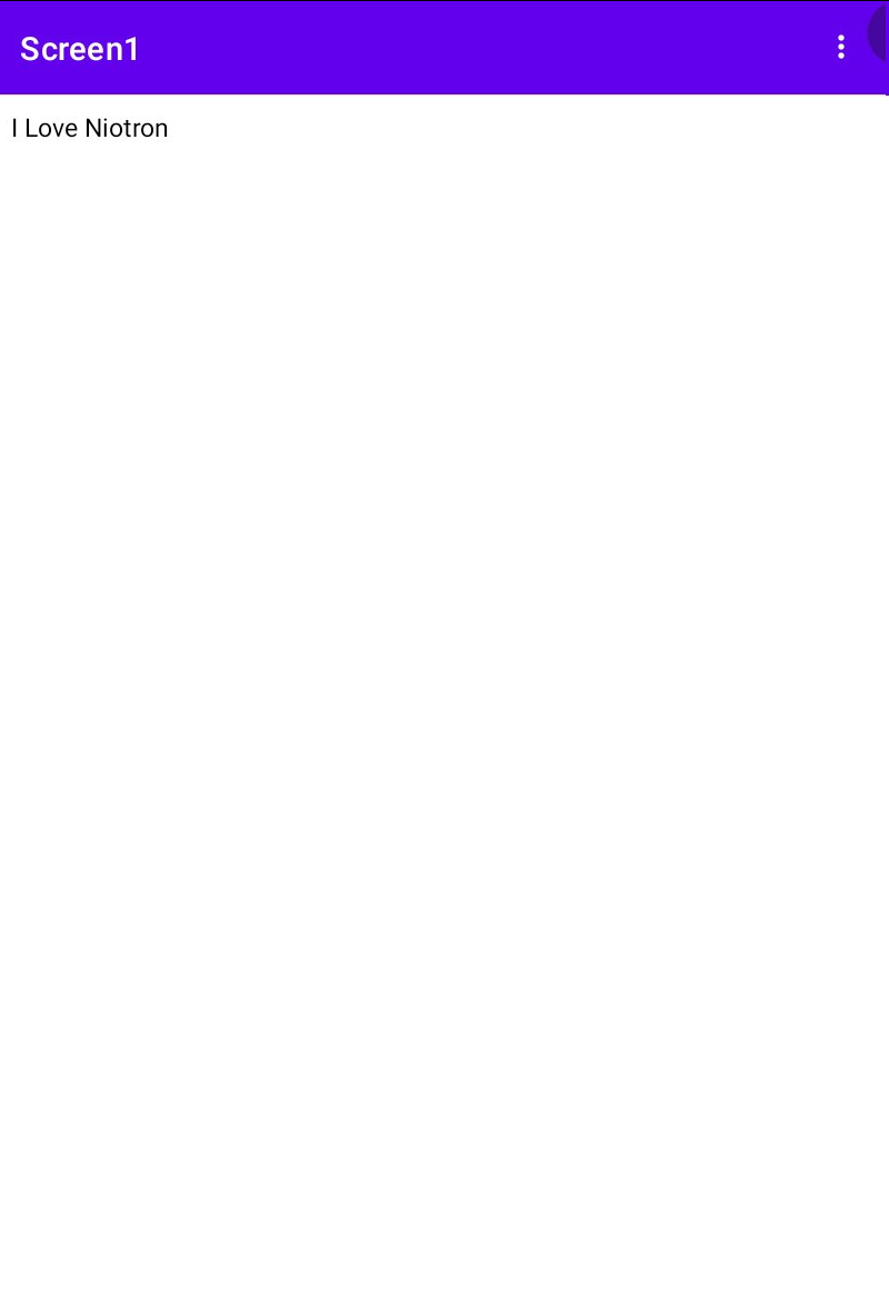
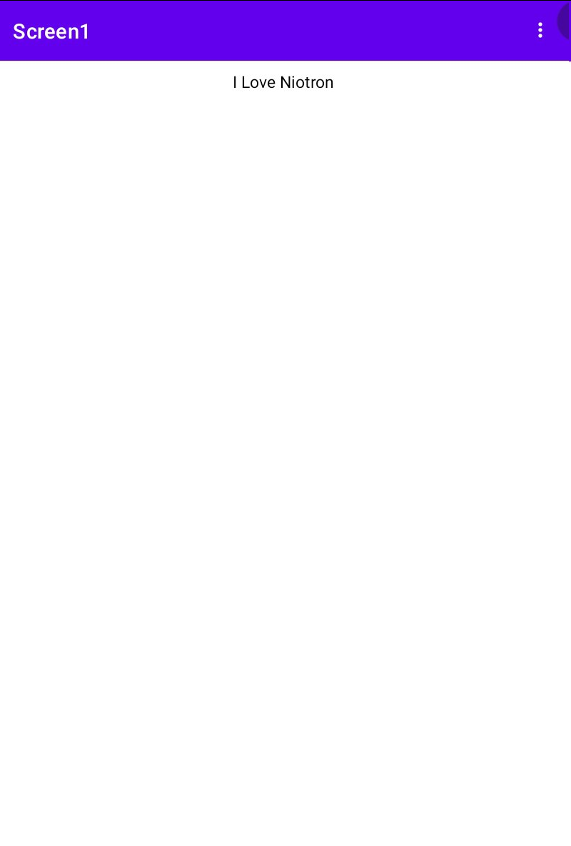
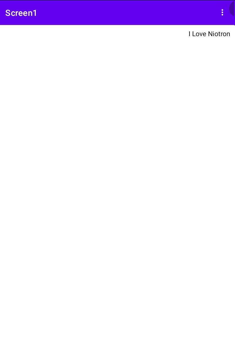
Note - this only works if the width of label if not auto
- TextColour - set the text colour you like
- Visible - you can enable if you want to set label visible else disable
- Word Spacing - Under Construction
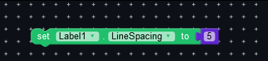
Let’s have a look at some blocks that aren’t in designer section

Click on the label to open blocks of the component
Niotron has compressed block after equal to in label component
Thanks @tanishraj for this topic 
 Stay Safe Stay Helathy