This ‘Ultimate List View’ extension is developed which uses android default dependencies and no external libraries are used in this extension moreover no permission is required to use this extension.
Tested in Android Version 7 to 14 and Niotron Companion. Works perfectly and handles the large datasets of list very smoothly.
This extension can be used in ecommerce app, matrimonial app, quiz app, Ebooks app, and so on.
Event triggers when item clicked will parse index, text and image url of the selected item
Event triggers when list is loaded after function ‘AddItems’ or ‘AddItemsWithSubTexts’.
To use a layout to show list, Vertical Arrangement is use in container and for searchBox textbox is to be used.

This block will clear/earse the list. It is useful to show different items in same list view again and again.
This block is used to choose how many subtexts is to be shown 0 to 5. Using 0 will show only main text and no subtexts will be shown.
This block is used to show the list of image (from url or asset) and title only.
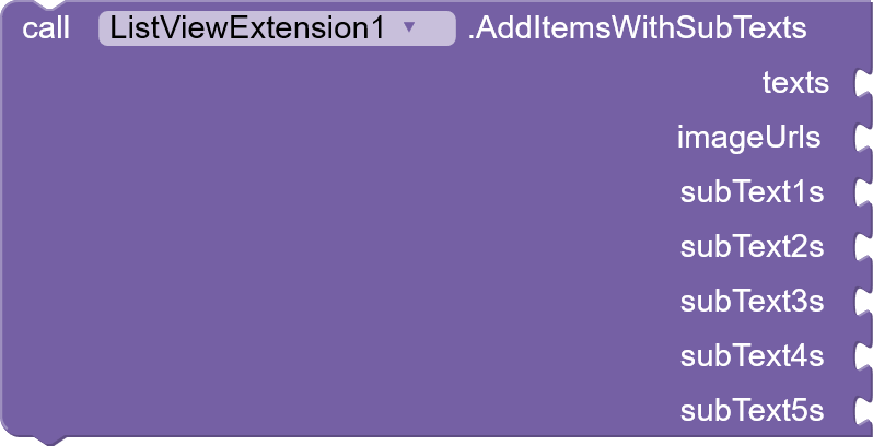
This block will add items to the list, in ‘texts’ a list of texts, in image Urls list of image urls or image names from asset, in subText1s to subText5s a list of texts/strings are accepted.
This block is used to make image circular. Set ‘true’ to make circular or ‘false’ to let the image corners round took from ‘SetImageCornerRadius’ block.
This block is used to set the image alignment in layout of the item which can be ‘left’, ‘right’ or ‘center’.
This block is used to set Image corner radius rounded.
This block is used to see the image in full screen size photo view when click on item image.
This block is used to set a margin between items in the list with setting the height of the item separator.
This block is used to set the list view style from Five different styles. Styles are as follows:
1: Vertical – image on top, then main text, then sub texts.
2: Horizontal – image on left, texts on right.
3: Horizontal – texts on left, image on right.
4: Vertical – sub texts on top, then image, then main text.
5: Vertical – main text on top, then image, then sub texts.
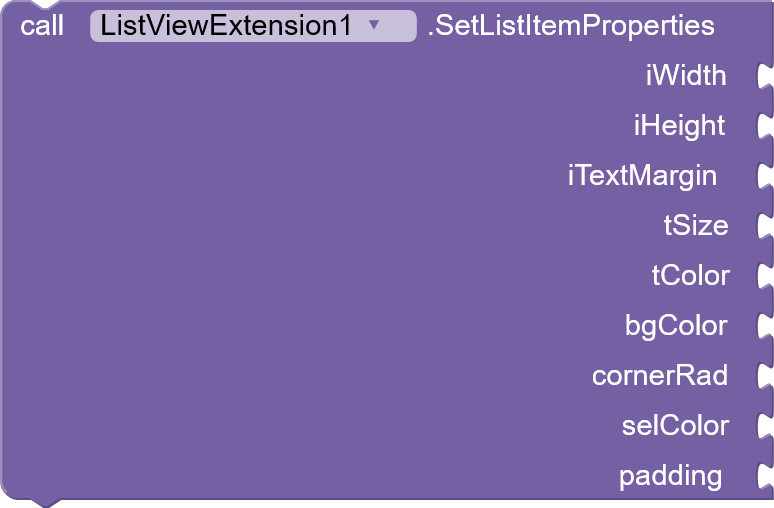
This block is used to set the properties of list item as follows-
‘iWidth’ to set image width,
‘iHeight’ to set image height,
‘iTextMargin’ to set margin between image and texts,
‘tSize’ to set main text size,
‘tColor’ to set color of the main text,
‘bgColor’ to set the background color of the items,
‘cornerRad’ to set the cornor radius of the items,
‘selColor’ to set the selection color when an item is clicked,
‘padding’ to set the padding of the items.
This block is used to set the main text i.e. title alignment which can be ‘left’, ‘right’ or ‘center’
This block is used to set the scroll bar visibility, set ‘true’ to see the bar or ‘false’ to hide the scrollbar of list view.
These blocks of SetSubTextAlignment from 1-5 can be used to set the alignment of all the sub texts separately. Use ‘left’, ‘right’ or ‘center’.
These blocks of SetSubtextProperties from 1-5 can be used to set the text size and color of all the sub texts separately.
Extension Size: 30 Kb only
[with this ‘Ultimate List View Extension’ 2 extensions will be given for free one which only provide list view with titles only i.e. no image (from url/asset) and subtexts with search feature included and another extension with image (from url/asset) and title list view only with search feature without subtexts.]
Price is just ₹ 999 For Indian Devs
$15 For Rest Of India
DM to buy.
With Best Regards
BharatTech


