I personally feel some UI improvements are needed in Niotron -
-
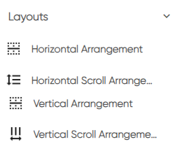
Icons of horizontal and vertical looks wrong they should be interchanged.
-
Previous theme of colored text / icon was way better than current boring black and white.
-
Block button should be bigger and isolated to avoid miss click, after all this the most used button.

and due to lack of color or maybe size I always forget which button is for what. they should be grouped properly. -
additional feature request- Blocks should be able to combine in different groups. so by mistake if I click “clean up blocks” they should not loose the group.
-
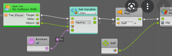
flow charts - something like below would be awesome