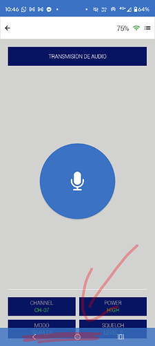
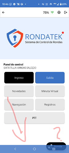
There is a problem with the new Niotron update. It happens that now the navigation bar doesn’t look good - it appears on top of the buttons even though initially everything was working very well before the update. When implementing this update, the navigation bar overlaps the content, making the user view look very bad. I please ask to solve this problem that prevents me from updating the version since the final result with the navigation is very poor.
Opt 1) Something quick, you can add a 60px space, and depending on the device’s SDK version you make it visible or not.
Opt 2) You can compile in Beta, which I think is fixed.
Should be fixed in the new Beta Version

