i would like to share my first “big” app in niotron - LinReg (for linear regression).
Linear Regression is a very common tool used for predicting the trend of a cluster of points that seem to exhibit a linear relationship - when one variable changes, the other variable seems to depend on the first variable in a consistent manner.
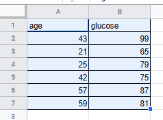
consider these observations of glucose readings in the blood for persons of different ages:
you feed the 2 columns (except the heading) to xlist and ylist respectively and my app will compute the regression line for you - expressed as slope and intercept.
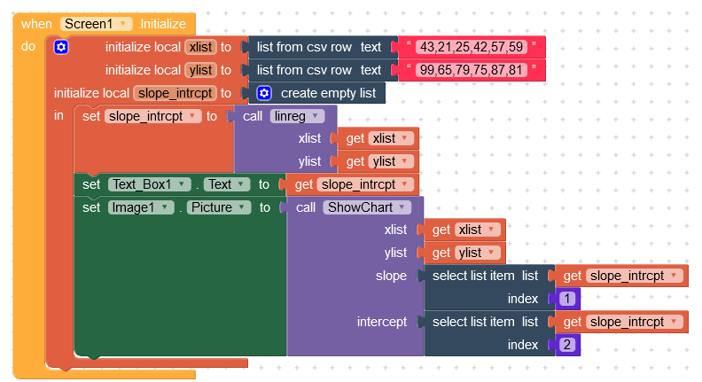
then my app plots the data as a scatter plot and the regression line as a straight line using quickchart.io via api. (the numbers on the top are the slope and intercept respectively).
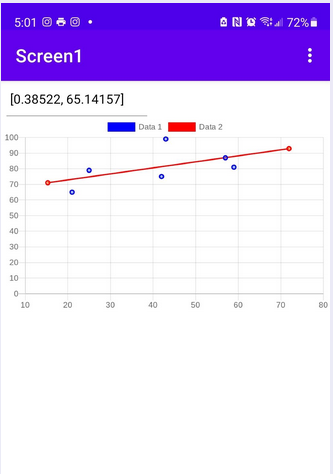
the regression line can be used to extrapolate for additional values. for example, using the chart, someone who is about 72 years old will probably get a glucose level reading of 92, give or take a few.
as you can see the tool can be used for forecasting, for example, sales for your business can be predicted for the next quarter if you apply linear regression to sales from past quarters a year or two ago. .
here’s the aia for you to try.
linreg.aia (8.6 KB)