![]() Introduction
Introduction
I was testing a couple of extensions and I realized that the Button Addon extension by Andres Cotes needs some updates, including the color of the icons, the sizes and some more. So I cooked up this extension to help you insert icons to your buttons. No assets for Android and Material, just download it, import it and you’re good.
This extension offers four types of icons.
| Icon Type | Description | Icons Available |
|---|---|---|
| Default | Android’s default icons that you can use, available in a helper block. | 67 |
| Material | Google’s Material Icons, available here. | 2,500 + |
| Custom | Your custom icons that you can add to your app! | Unlimited |
| Font | Icon fonts in your assets or ASD. | Unlimited |
The default icons that Android provides in the R.drawable class are kind of old, so I recommend you to use them only if you are making apps intending for old Android devices, or apps with the Classic theme, although you can technically use any icon for any theme. Material Icons are icons provided by Google using material design, and if you want to build an app with professional UI, this should be for you.
![]() Stats
Stats
![]() Built with: AppInventor Extensions Template
Built with: AppInventor Extensions Template
![]() Version: 2
Version: 2
![]() Documentation
Documentation
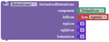
SetAndroidButtonIcons
Sets the icon of the specified button, using the default Android drawable icons. Use 0 if you do not want an icon to appear.
Parameters: component = component, leftIcon = Icon/number(int), topIcon = Icon/number(int), rightIcon = Icon/number(int), bottomIcon = Icon/number(int)
SetCustomButtonIcons
Sets the icon of the specified button. Use an empty text block if you do not want an icon to appear. Please use absolute paths or full paths in this instance.
Parameters: component = component, leftIcon = text, topIcon = text, rightIcon = text, bottomIcon = text
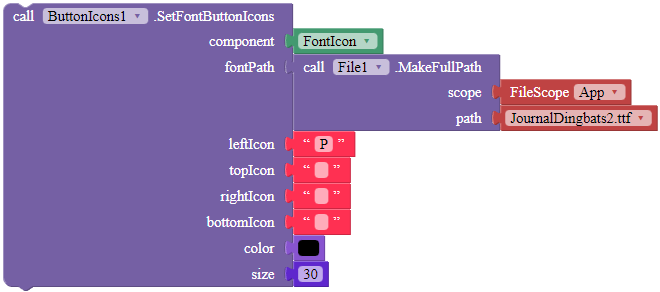
SetFontButtonIcons
Sets the button’s icons from the given icon font. Please use absolute or full paths in this instance. If you do not want an icon, use an empty text block.
Parameters: component = component, fontPath = text, leftIcon = text, topIcon = text, rightIcon = text, bottomIcon = text, color = color, size = number (int)
SetIconPadding
Sets the size of the padding between the icon and the text, in pixels.
Parameters: component = component, padding = number (int)
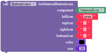
SetMaterialButtonIcons
Sets the material icon of the specified button. Use an empty text block if you do not want an icon to appear. The size of the icons should be in pixels.
Parameters: component = component, leftIcon = text, topIcon = text, rightIcon = text, bottomIcon = text, color = color, size = number (int)
![]() Downloads
Downloads
AIX (V2):
com.gordonlu.buttonicons.aix (190.2 KB)
AIA (V2):
ButtonIcons.aia (235.1 KB)
![]() FAQ
FAQ
Q1: Does this extension support GIFs?
A1: No, unfortunately it does not. Try using a JPG or PNG image instead.
Q2: Is this extension open source?
A2: Yes of course! You can modify the code here in GitHub, but please give me a credit by linking to this topic and mentioning the author.
![]() Credits
Credits
Thanks to @Kumar for helping me creating this extension and for his guidance, shout-out to him.
Also, thanks to @Shreyash for his guide on creating extensions, I’m using Extensions Template for the first time and this is only possible because of his guide.
Please click the beautiful ![]() Like button if you like the extension, it took a lot of effort and time to make it.
Like button if you like the extension, it took a lot of effort and time to make it.
As I have exams from the 3rd to 13th next month, I definitely need a break from the builders. I’ll be back in 2 weeks. Please, if you have questions in those two weeks, drop a reply in this post and I’ll answer your questions after my exams. Goodbye.
Gute Rutsch! Happy New Year! 新年快樂!


