Hi there, in this topic we will learn about Card-view with complete details. 
Index
-
Card-view click event
-
Card-view long click event
-
Card-view alignment
-
Card-view background color
-
Card-view padding
-
Card-view corner overlap
-
Card-view elevation color
-
Card-view height & width
-
Card-view background image
-
Card-view long clickable property
-
Card-view Radius
-
Card-view ripple enabled
-
Card-view ripple color
-
Card-view visibility
Card-view click event
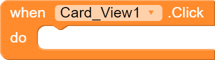
This block is triggered when the user clicks on the the visible Card-view.
Card-view long click event

This block is only triggered when Card-view is long clicked or clicked for more than seconds.
Card-view alignment
Here are some of the blocks which align things in card view in a custom way. You can also change them in designer properties. They are Horizontally Left aligned and Vertically Right aligned.
- Horizontal alignment
- Vertical alignment
**
Horizontal Alignment
Values for Horizontal Alignment
1 = Left Aligned
2 = Right Aligned
3 = Center Aligned
–
Vertical Alignment
Values for Vertical Alignment are different
1 = Top Aligned
2 = Center Aligned
3 = Bottom Aligned
Card-view background color
This block allows you to set the background color of a Card-view, you can also do it in designer properties. This block also needs other color block when can we found in COLORS group in the blocks editor.
Card-view padding
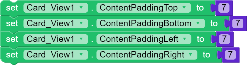
This feature is allows you to set margin inside the card view with the given value. However the value is set to 5 by default. You can find padding to set for each direction of the Card-view, those are Top, Bottom, Left and Right.
Card-view corner overlap
On Pre-lollipop platforms, Card-view does not clip the bounds of Cards for the rounded corners. It is false by default
Card-view elevation color
Elevation is shadow called in Card-view. You can also find this option in designer properties of the Card-view. This block help us to set the rate of the shadow of Card-view
Card-view height & width
- Sizing in Pixels
- Sizing in Percentage
–
Sizing in pixels
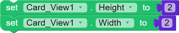
These blocks can be used to set the height & width measured in pixels, you can do it with designer properties too. I personally don’t recommend these blocks or use of pixels because as they are in pixels, they look different in other devices, so instead use Percent value.
**
Sizing in Percentage
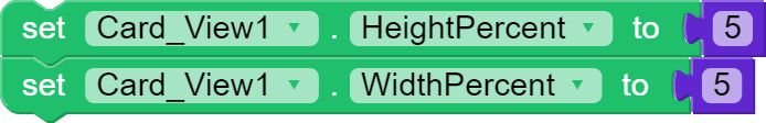
These blocks helps you to adjust the height & width of a Card-view in Percent which are fixed.
You can set the value from 1 to 100.
Card-view image (background image)
This block helps you to set the background image of a Card-view, you can set the image which is in the assets or in the phone. This can be also set in designer properties.
Card-view long click property
Using this block, you can set if the card view should be long clickable or not. You can also set in designer properties and by default it’s false.
Card-view radius or radious
Using this block, you can set the curvdness of Card-view, this can be also done in designer properties and by default it’s 2. I prefer you to only put value from 0 to 30. If you put more than 30, it would look different in older devices.
Card-view ripple color
Using this block, you can set the touch color which is known as ripple color of the Card-view. It only works if Ripple property is enabled. You can also set in designer properties and by default it’s dark grey.
Card-view ripple enabled property
Using this block you can activate or deactivate the ripple of the Card-view. It’s false by default and also you can set in in the designer properties.
Card-view visibility
This block allows to set the visibility of the Card-view, it’s true by default, and click and long click event will only work it’s visible. You can also set it in the designer properties.
Hope you liked the guide! If something is missing or any suggestion kindly say me, it will be appreciated.
Was it helpful?
Comment down below.
Xoma
Graphic Designers
Happy Niotroning!
/XOMA DEV