 Introduction
A non-visible extension that provides additional tools to the built-in Notifier component in  Niotron. This extension has:
-
custom choose dialog (two option buttons and one cancel button).
-
number picker dialog (pick a number).
-
custom password dialog (allow the user to input a password. The ShowPasswordDialog block in Notifier only has 3 parameters, this extension has 12.)
-
custom text input dialog (allow the user to input text. The ShowTextDialog block in Notifier only has 3 parameters, this extension has 13.)
 Version: 3
 Package name: com.gordonlu.daffydialog
 Release date: 2022-03-25T12:30:00Z
 Documentation
Event blocks
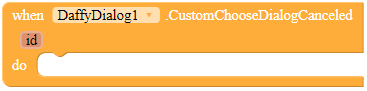
CustomChooseDialogCanceled
This event is fired when the user has pressed the cancel button in a custom choose dialog.
Parameters id = number (int)
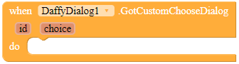
GotCustomChooseDialog
This event is fired when the user has pressed button1 or button2 in the custom choose dialog.
Parameters: id = number (int), choice = text
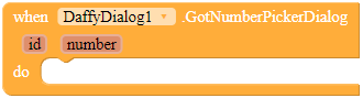
GotNumberPickerDialog
This event is fired when the user has selected a number in a number picker dialog.
Parameters: id = number (int), number = number (int)
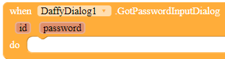
GotPasswordInputDialog
This event is fired when the user has entered their password in a password input dialog.
Parameters: id = number (int), password = text
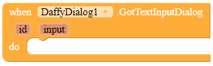
GotTextInputDialog
This event is fired when the user has entered some text in a text input dialog.
Parameters: id = number (int), input = text
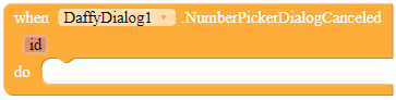
NumberPickerDialogCanceled
This event is fired when the user has canceled the number picker dialog.
Parameters: id = number (int)
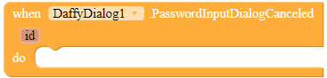
PasswordInputDialogCanceled
This event is fired when the user has canceled the password input dialog.
Parameters: id = number (int)
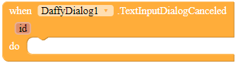
TextInputDialogCanceled
This event is fired when the user has canceled the text input dialog.
Parameters: id = number (int)
Method blocks
 Note the following:
-
I do not need the ID parameter. It is only for you to distinguish 2 dialogs with the same extension. If you don’t want to distinguish them, fill in the ID to any integer.
-
If you have set cancelable to
false, the cancelButtonText parameter will be ignored.
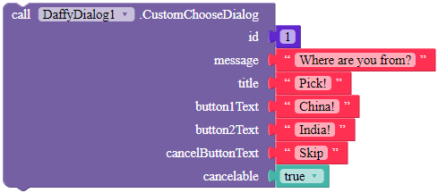
CustomChooseDialog
Shows a custom choose dialog. The id parameter is an ID to specify the notifier, in case you want to show two dialogs with the same extension. The title and message parameter are for specifying the title and message of this dialog respectively. When the user has tapped button1 or button2 in this dialog, the extension fires the GotCustomChooseDialog event. If it is canceled, the extension will call the CustomChooseDialogCanceled event.
Parameters: id = number (int), message = text, title = text, button1Text = text, button2Text = text, cancelButtonText = text, cancelable = boolean
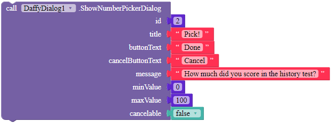
ShowNumberPickerDialog
Displays a number picker dialog that enables the user to select a number from a predefined range.
Parameters: id = number (int), title = text, buttonText = text, cancelButtonText = text, message = text, minValue = number (int), maxValue = number (int), cancelable = boolean
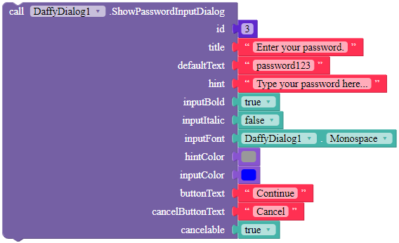
ShowPasswordInputDialog
Shows a password input dialog. The id parameter is an ID to specify the notifier, in case you want to show two dialogs with the same extension. The title parameter is for specifying the title of this dialog. defaultText is the default text for the input in which the user will first see in the textbox when they open the dialog, and hint is the hint of that textbox. Use inputBold, inputItalic, hintColor and inputColor to customize the textbpx, and use the property blocks to specify inputFont. buttonText is the text of the OK button, while cancelButtonText is the text of the cancel button.
Parameters: id = number (int), title = text, defaultText = text, hint = text, inputBold = boolean, inputItalic = boolean, inputFont = text, hintColor = color, inputColor = color, buttonText = text, cancelButtonText = text, cancelable = boolean
ShowTextInputDialog
Shows a text input dialog. The id parameter is an ID to specify the notifier, in case you want to show two dialogs with the same extension. The title parameter is for specifying the title of this dialog. defaultText is the default text for the input in which the user will first see in the textbox when they open the dialog, and hint is the hint of that textbox. Use inputBold, inputItalic, hintColor and inputColor to customize the textbpx, and use the property blocks to specify inputFont. buttonText is the text of the OK button, while cancelButtonText is the text of the cancel button.
Parameters: id = number (int), title = text, defaultText = text, hint = text, inputBold = boolean, inputItalic = boolean, inputFont = text, hintColor = color, inputColor = color, buttonText = text, cancelButtonText = text, cancelable = boolean, inputType = number
(boolean)
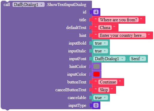
For the inputType parameter, here are some examples.
-
plain old normal text - 0.
-
number - 2.
-
phone number - 3.
-
date/time - 4.
-
email address - 32.
For more, read the Android Developers documentation.
https://developer.android.com/reference/android/text/InputType
 Sample Blocks
Sample blocks are in the documentation!
 Downloads
AIX:
com.gordonlu.daffydialog.aix (18.2 KB)
 Open Source
Here you go.
 Why this extension?
Currently in Niotron, we do not have a lot of options for choose dialog, text input, etc. Although you can use layouts for custom dialogs, if that increases, your app pile up like regrets. This extension is used to fill in the gaphole.
Made with Niotron IDE.
Kindly  PM me if you have any questions! Also, if you like my extension, please
  like it! It takes some effort for me to make it…
Votes and likes tell me the general user feedback of my extension. If you read this extension, please take 20 seconds to drop by and give a vote / like!
If you have any features that you want to add and you know the code, PM me or directly reply below using the Reply button.
By downloading my extension, you agree the terms and conditions in my website
Gordon Lu
 Website
 E-mail